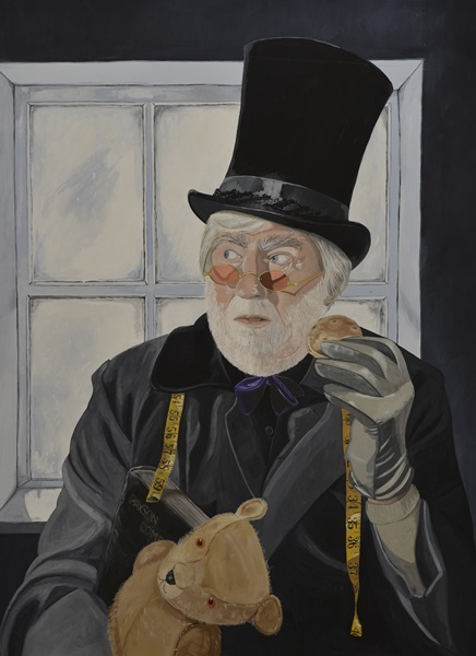
I fell in love with the fairytale quality of Amanda Cozens’ paintings the moment I laid eyes on it. They draw to the surface the kind of imaginings prompted by tales read and told to me when I was a child, but far from being fey, the women featured in her work are forces to be reckoned with. Hints of ancient myths run through them, providing the sense of stepping into the centre of a scene with much more to come.
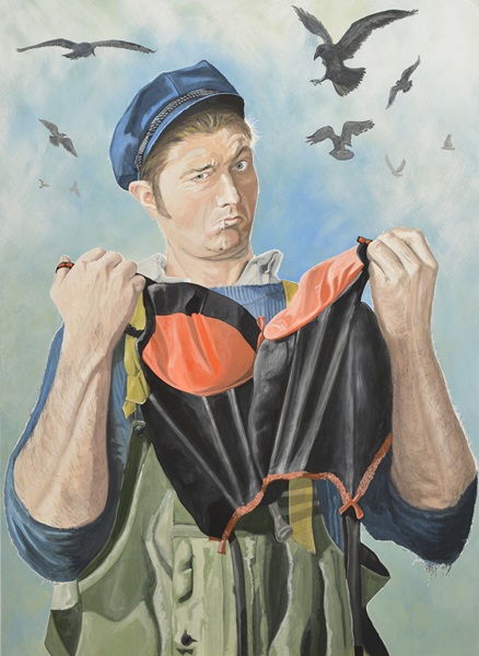
Narrative is something that comes naturally to Amanda. “Inspiration sometimes comes from something going on in my own life – a theme I’ve noticed and automatically ‘storyfied,’” she says. “Narrative is a strong personal survival skill as well as being important in my work so it’s inevitably going to bleed into a new piece. Often I’ll feel drawn to paint a certain animal or creature and it ends up quite totemic.”
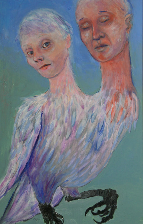
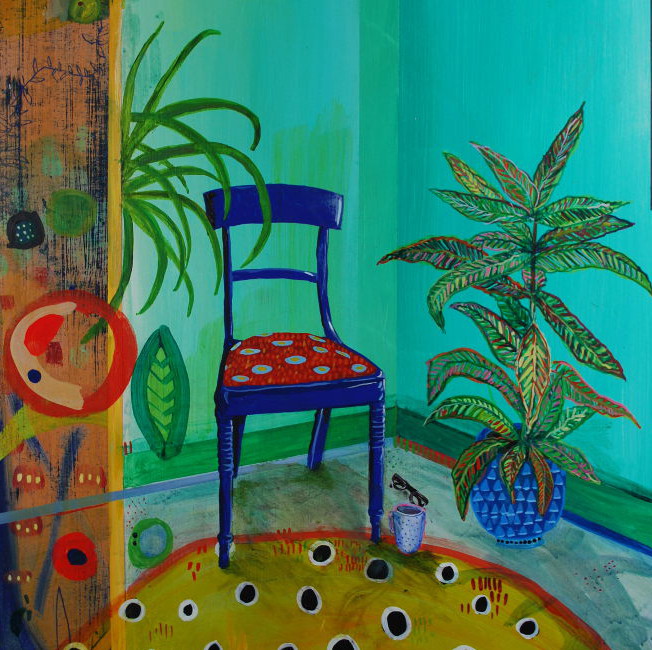
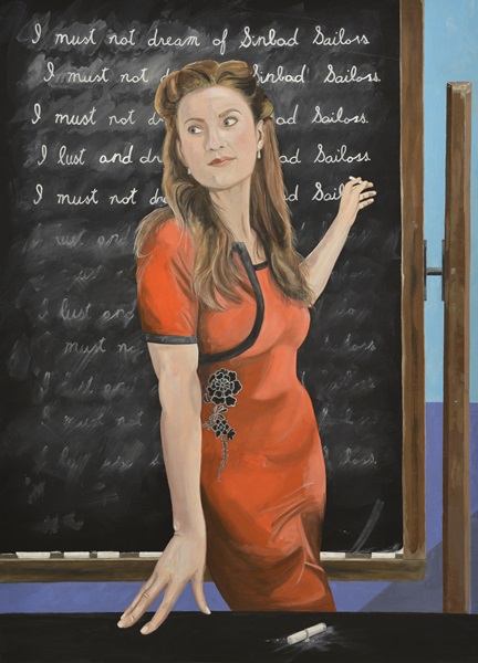
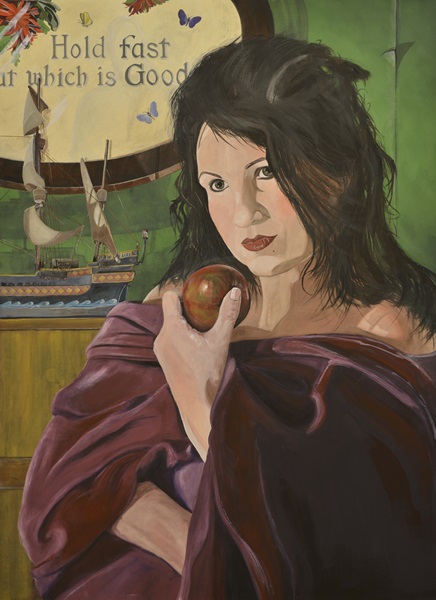
Twins by Amanda Cozens
A survival skill? That’s true for me too, but I’m intrigued to discover Amanda’s version of this. “I have the sort of mind that has always learned and problem-solved through making things into stories,” she says. “It’s second-nature just like some people are very numerical or practical. Even in art school, when my works appeared to be quite abstract, in my mind they were still very strongly rooted in the narrative I had experienced with them.”
I’m curious to know the kinds of things that run through Amanda’s head as she’s working on a new piece of work.
“I get totally immersed when I’m working on a new piece,” she comments. “It’s hard for me to let go. I think in pictures and I see myself beneath a great invisible, fast moving river than runs just at the height of my upstretched hand. Beyond its membrane is, well, everything. Life, inspiration, branches and tendrils of seemingly unrelated narrative and colour and texture. I dip my hand in and see what I can catch!”
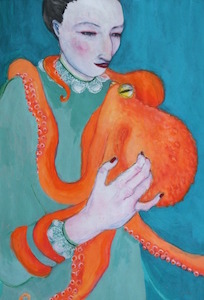
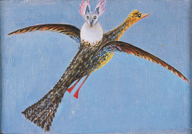
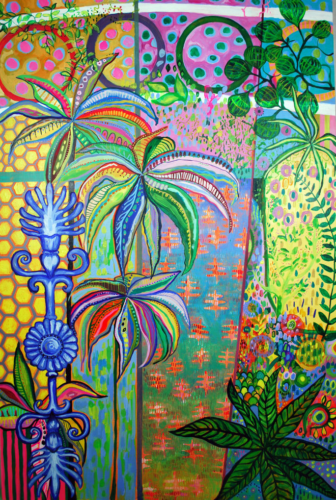
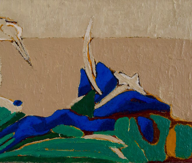
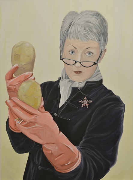
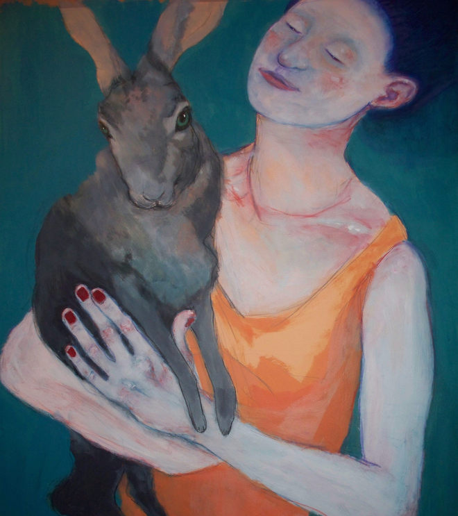
Octopus by Amanda Cozens
Amanda studied fine art at Falmouth School of Art. “Kife drawing was my baseline really, the tool I used to develop my language and something I return to again and again.”
She describe her process as “acrylic overlaid with drawn pigment”, which she explains means the following:
“I layer thin and thickly applied acrylic paint over drawing, and then draw over those layers,” she says. “I love using watercolour pencils for this, meaning I always have the option to blur and waterdown any line. I incise lines by scratching into the paint and often pare back using wire wool.”
Amanda hopes to provoke layers of ideas and feelings in her viewers.
“I love that they may stir a long-forgotten memory or collective unconsciousness and trigger a connection that may not have been there before – a catalyst for some personal narrative that I may never be party to,” she says.
For Amanda, honesty is the most important aspect of her work. “Being genuine is vital,” she says. “Art is the space I hold for myself where I can be the most authentic amidst the other work of mothering and being responsible and fitting in adequately and bills and all the other marvellous things in life.”
Amanda can often I often be found at arts trails or markets with prints of my work as well as clothing that she makes. “I’ll be at Bristol Folk House Flea Market on 23rd July.”
Keep an eye on what Amanda’s up to and see more of her glowy art at www.glowything.co.uk.
Are you an artist or do you know an artist who would like to be showcased on SkyLightRain.com? Get in touch at judydarley(at)iCloud.com.